Web design may be maturing, but it’s still subject to fads, fashions and whims. If we’re lucky, who knows, some trends might just be user friendly.So, what’s coming in 2018? Here are a few predictions.
1. The death of flat design
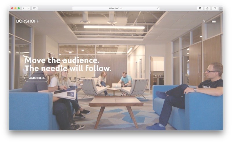
When we look at the 21 Award-Winning Website Designs and What They Did Right, Most of the designs have changed in the recent times.
As early as 2014, Co.Design was asking “Is flat design already passed?” And this year designers are all talking about drop shadows and gradients again, the affordances that Grant talks of.
Indeed, a study by Nielsen Norman Group in 2017 showed that users took 22% longer to navigate through an ultra-flat design.
2. Video
We’re not exactly putting our neck on the line in predicting video will be big. It already is. From media sites that are pivoting to video, to more ephemeral video on social networks, and video in website design – it’s everywhere.
Video, however, remains a bit of a controversial web design element to some UX professionals. Especially in ecommerce, it can be seen as a distraction, lumped in the same category as auto carousels
However, as always, the usefulness of video depends on what the website and designer are trying to achieve. I still believe hero/background video has a place on desktop – for example, click through the GIF below to visit the new Barbican website (launched in late 2017) and I defy you to say the video background doesn’t convey the scale and splendour of the Barbican’s architecture.
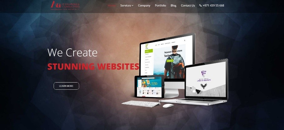
Away from backgrounds, writing on our Ava IT Solutions and Consulting blog highlights the utility of the video HTML element. Ramiz says:
It can slip seamlessly into the design
It remains extremely high quality
It can be looped to…repeat for those who need it
Check out the Ava IT Solutions & Consulting Dubai homepage and you can see an example of this, mentioned below as the video. As I scroll below the fold, there’s a video element showing us the services and about Ava IT Solutions and Consulting Services. As we mentioned, the beauty of video is its ability to “convey complex information” – surely a great tool for B2B websites, for example.
3. Subtle scrolling effects
Parallax scrolling has been and gone, with many designers recognizing that slow load times and a negative impact on usability represent too high a price to pay for the effect. But that doesn’t mean there can’t be joy in scrolling. One of my favorite examples is the use of an attached background image that doesn’t scroll with the page.
Sticking with the Barbican website, you can see an example below. Okay, it’s perhaps not the best example, given the white text isn’t the easiest to read, but the effect certainly has an impact.
There’s another great couple of examples on the Made by Many homepage. This is also a trend we may see more of in digital advertising, with the scrolling format already pretty well established and using similar principles to catch the attention of the viewer.
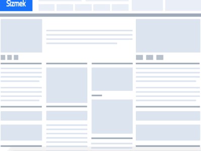
Below are a couple of examples, one on mobile (via the IAB) and one on desktop (via Sizmek’s library of ad formats). The below format is seen as a positive experience for the user, in that they get to control the reveal (and disappearance) of the ad, and therefore it doesn’t impose as much as a sticky ad might.
There are parallax scroll ad formats, too, which aren’t dissimilar, though they do take longer to load and are arguably a little more disorienting.
Charity websites must tackle content design information architecture.
4. Death of the ghost button
Arguably this isn’t a big deal, but I feel compelled to address it, given the ghost button is one of the web design trends we have trumpeted in previous years.
Christopher Ratcliff rightly pointed to the boom in ghost buttons at the end of 2014, referring to them as “not quite a call-to-action. Perfect for designers not wishing to clutter their sites with albeit necessary navigation.”
Unfortunately, this proved to be too accurate a description i.e. these buttons simply don’t call the user to action.
A fantastic blog post by Bartholomew Fish details the provenance of ghost buttons (coming out of flat design) and shows some highly miss able examples.
The problem is that ghost buttons don’t offer sufficient contrast when placed over busy imagery or text. Similarly, if button text color is too similar to background image color, there can be a contrast issue. The result can be a 20% decrease in clicks, according to some studies detailed in Fish’s blog post.
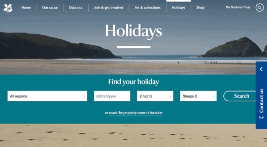
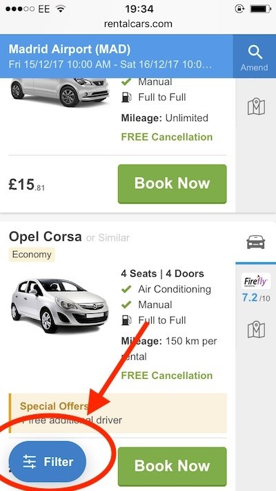
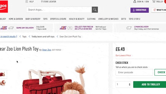
5. Sticky nav
Sticky or fixed navigation, such as header menus that follow you (or stick in place) as you scroll down a page, is not particularly new. But as retailers redevelop their eCommerce sites, it’s a design feature we are seeing more and more of.
Here are three examples:
National Trust’s sticky secondary nav on its Holidays website
RentalCars.com’s listings pages on mobile (with sticky filter)
Argos’s product page on desktop (with sticky ‘add to trolley’)
In fact, the aforementioned John Moore Williams of webflow even highlights a possible trend for floating header menus – this is the same principle but the menu appears to float, allowing the homepage visuals to continue behind them. See the homepage of Le Réseau COOP for a good example.
6. Typography
A trend for a few years now – typography as visual. Serif fonts are making more of an appearance, too.
We’ve seen agency websites using impactful typography throughout 2017.
7. Brutalism meets luxury ecommerce
Brutalism is a style of architecture that flourished in the 1960s and is so-called after Le Corbusier’s description of one of his materials, béton brut (raw concrete). Seeing as we’ve mentioned the Barbican twice already, it’s worth pointing to again as perhaps the most famous example of a brutalist development in the UK.
Anyway, it seems the term has been co-opted into web design at some point in 2016. It’s worth checking out a wonderful template for UX brutalism created by the UX Design Collective.
Brutalism is a style most often seen on adventurous agency websites and artist websites – generally fairly limited affairs in terms of number of pages and degree of functionality.
However, 2017 saw brutalism get a lot of attention thanks to the Balenciaga ecommerce website redesign. You can check out a thorough Econsultancy review of the site from back in July. For all their doubts, most of our commenters admired Balenciaga’s bravery.
Will we see more luxury brands turn to their cement mixers?
8. Curves
Twitter replaced square profile photos with round ones in 2017, as well chamfering off square edges throughout its design.
Google, too, got its plane and its sandpaper out and had a go at those dangerously sharp edges on its search box and cards.
9. Mobile Animation
Airbnb Lottie is a library that allows “apps to use animations as easily as they use static images.” John Moore Williams highlights it as one of the many tools emerging to help designers create more complex interactions.
10. Web VR?
I needed something for the 10th trend in this list. Will web VR enter the average consumer’s life? I doubt it (and Mark Ritson scoffs at the idea). But Google is still curating experiments.
About the Author
Ramiz Al Jalbani
Ramiz is a content writer and a supply chain professional focused on IT and Trading. He has a wide experience of using the new and latest technology to trade businesses. A true Middle Eastern and South Asian Market insider, Ramiz shares his thoughts and opinions in the form of weekly essays that you can subscribe to via subscribing to blog of Ava IT Solutions or email. He has written numerous essays, articles and blogs which have been featured and quoted in different journals around the globe. The topics range from Digital Marketing, Social Media Trends, Technology Trends and Integration of Business Processes to IT.
